Branding · Logo Design · Print Design · Shopfront Decoration
ABOUT THE PROJECT
Uber Scuba launched their new dive center in 2014. We were asked to help them build their brand up from zero. A full context analysis was performed, to fully understand their market and competition, enabling us to pinpoint their strongest differential brand values. Their logo was based on the image of a whale. Loved by all divers, with a huge traditional background, this mammal also portrayed their most important brand values: fun, beauty, safety, and master of currents. Their graphic style also reinforced the fun aspect of diving, something that is very important to do in Komodo where they are located, as the presence of very strong and dangerous currents can be discouraging to some divers.
CONCEPT & CORPORATE ID
MERCHANDISING
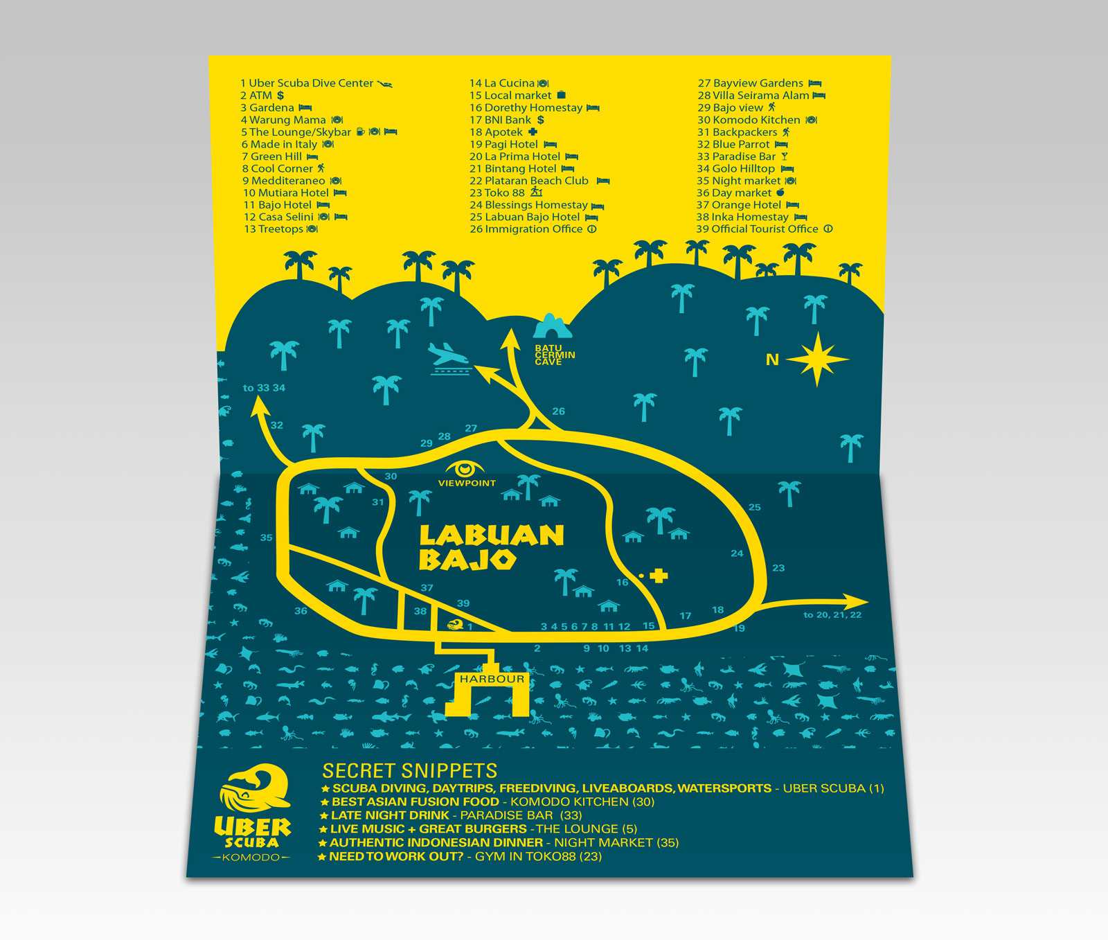
DIVE MAP
PRINT DESIGN
SHOPFRONT DESIGN
PORTFOLIO
This website uses cookies to ensure you get the best experience on our website.